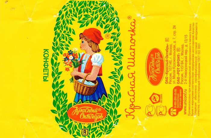
In the 19th century sweets’ wrappers were designed by the most prominent Russian artists such as Vasnetsov and Vrubel. During the first period of the Soviet era, wrappers’ design became the work of the avant-garde: Kandinsky and Rodchenko are just two of the minds hidden behind the images that go often unnoticed to the candy consumer. “Little Red Riding Hood” is a work of the artist and the historian of church Michail Gubonin.
Sydney Vicidomini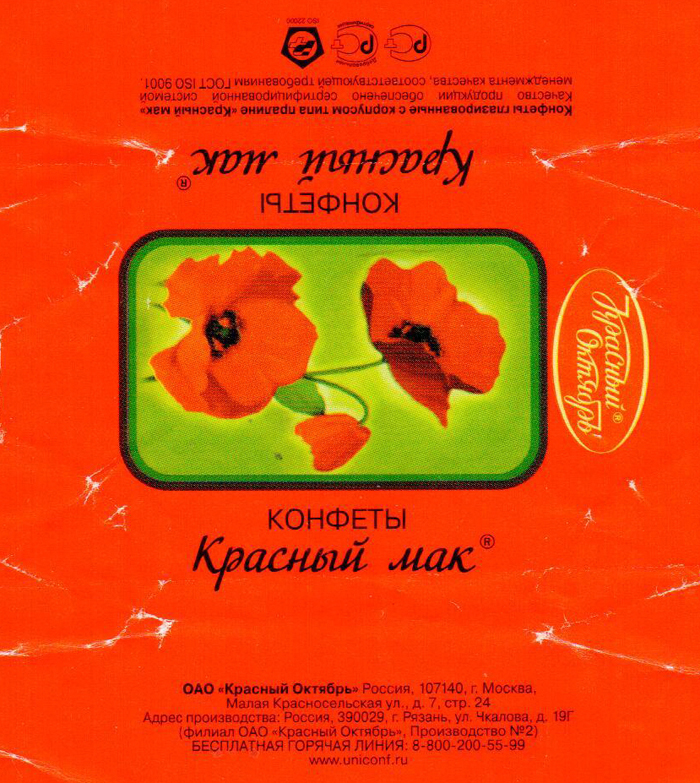
In 1851, German entrepreneur Theodore Ferdinand von Einem funded one of the oldest sweets’ factory in Russia that bore his name - Einem. After the revolution, the factory was nationalized and named “Confectionery factory No.1”. Only in 1922 its name was changed to “Red October”, a brand known for having intrigued generations of Soviet children with its colourful wrappers. // This is “Red Poppy”: it probably takes its name from the homonymous ballet showcased at the Bolshoi Theatre in 1927. It was the first Soviet ballet with a modern revolutionary theme.
Sydney Vicidomini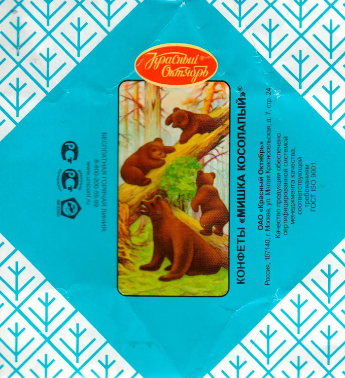
A bright example of how art was used in the styling of wrappers is “Mishka the bear”. The name in Russian (“Mishka kosolapy”) reminds of a popular nursery rhyme, while the picture is actually a reproduction of Ivan Shishkin and Konstantin Savitsky’s “Morning in a Pine Forest”, painted in 1889.
Sydney Vicidomini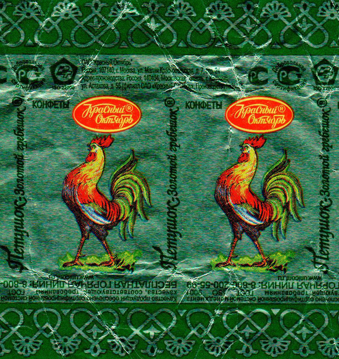
Chocolates and candies of “Red October” were quite expensive and hard to find for the average Soviet child. That is why children used to play with wrappers: the game consisted in winning your mate’s “fantik” by skillfully flipping it with the touch of your thumb. In this picture, you can see the cockerel from the 1955 cartoon based on Aleksey Tolstoy’s version of a folk fairy tale.
Sydney Vicidomini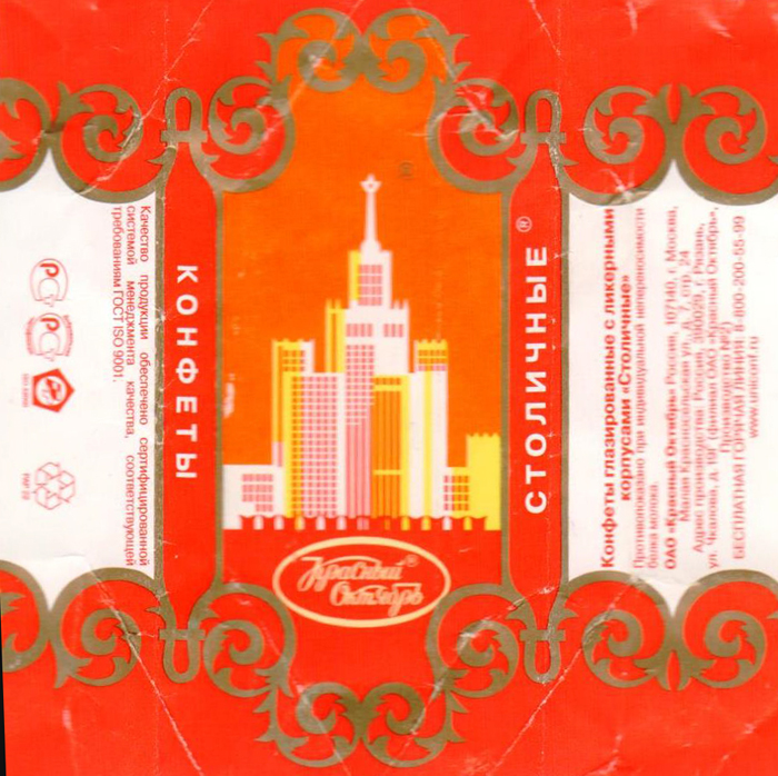
“Red October” wrappers accompanied every moment of Soviet history: there were series dedicated to pilots, to the Olympic Games or to the exploration of space. “Stolichnye” means “the chocolates of the capital city”: they had a vodka filling and wrappers featured the “Seven Sisters”, a group of skyscrapers designed in the Stalinist empire style.
Sydney Vicidomini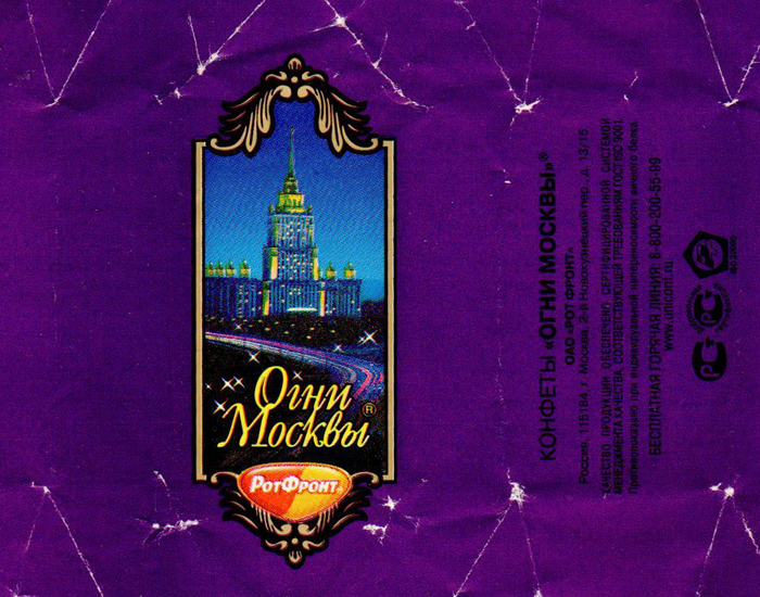
After the fall of the Soviet Union, “Red October” was privatized and in 2002 it joined the holding “United Confectioneries”, which gathers many brands, including the popular Babaevsky and Rot Front. Rot Front imitates the theme of the capital city on sweets’ wrappers: “The lights of Moscow” shows the same landmark of Stalinist architecture glowing under the night sky.
Sydney Vicidomini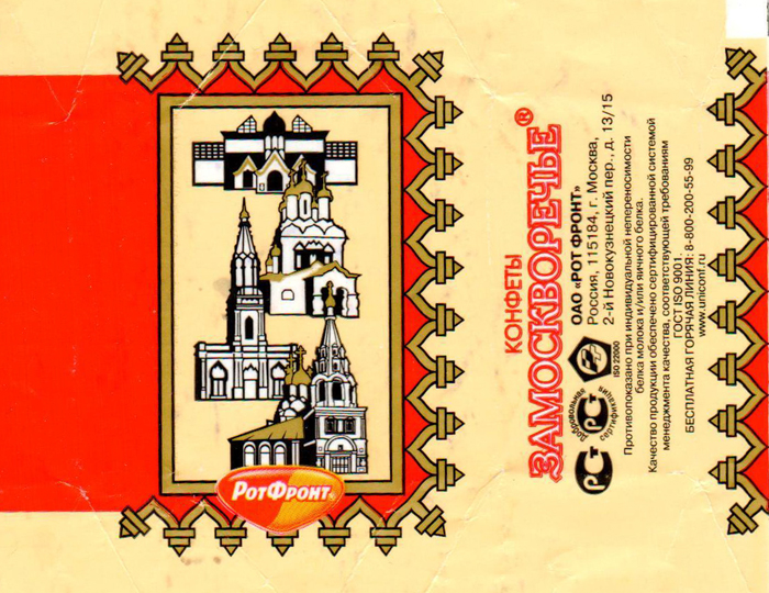
Another Rot Front product is “Zamoskvorechie”: it takes its name from one of the oldest Moscow districts, where historically merchants lived, and it features its main architectural landmarks.
Sydney Vicidomini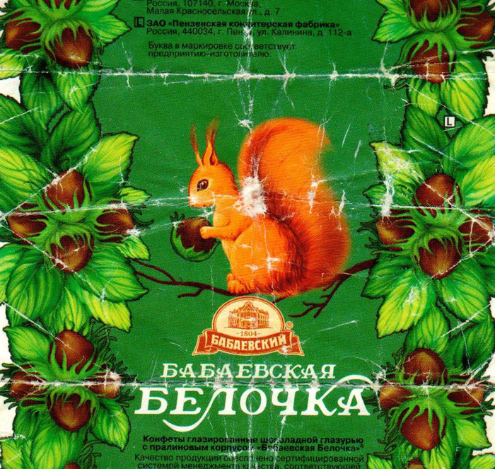
“Belochka”, the squirrel, is an immortal brand and a product of the Babaevsky confectionery. Many other praline chocolates imitate this design on the Russian market. It is a common pattern in Russia to name sweets after animals.
Sydney Vicidomini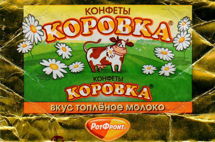
A classic example is “Korovka”, the little cow. It is a fudge toffee candy originally created in Poland and later distributed all over the Soviet Union and the world.
Sydney Vicidomini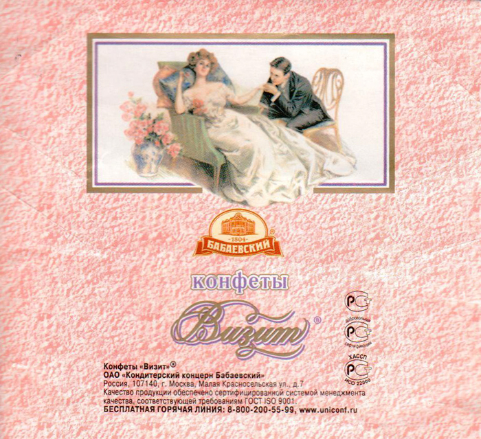
Sometimes wrappers may have a nostalgic appeal, which reveals that not only they represent beauty and the national folklore, but they also pursue a subtle commercial strategy. A gentleman is bowing to a lady on a white and pink background: what might he be telling her? “Will you be mine?”
Sydney VicidominiSubscribe
to our newsletter!
Get the week's best stories straight to your inbox